Great examples of print media advertising and why they worked
Using print media to advertise your business these days might seem very challenging. After all, a print ad today must compete with memes.
Some think that this task is impossible.
Not us.
We’re here to tell you that, fortunately, there’s a lot that print advertisers can learn from memes.

A meme is just the right combination of words and images. There are many layers to both, which you will see in these great examples of using print media to advertise your business:
- The beer cooling ad
How many beer drinkers have wished they could speed up the cooling process? Probably like 99.9%.
Well, this ingenious ad lets you wrap the ad itself around the bottle after soaking the ad in water first. You then put the bottle in the freezer.
(the print ad was formed with salt particles which reduces the freezing point of the water.)
- A unique ad
This ad was soo good that it won the Mobile Grand Prix at Cannes in 2014.
The ad includes a wristband that you can put on your child as well as a set distance limit that alerts your app when he crosses it.
Unique concept in an ad = a win.

- Proof is in the pudding…
This is an engineering and tech university that had the goal of recruiting more students.
Instead of doing the standard billboard of smiling graduates, it demonstrated a “proof is in the pudding” concept and infused their technology into their print billboard.
Their billboard absorbed the water from humidity to create enough water for hundreds of families in Lima, Peru, which gets very little rainfall.
- Phone Chameleon?
They worked with Wire to promote their phone’s customization options. By simply pushing a button, they could change the phone’s color.
- Car ad comes to life

This creative print ad from Peugot features a page with the interior of a car, followed by a second page.
When you hit the first page, the second page will have the replica of the very same airbag pop up out of the page.
Yes, we aren’t kidding about that.
- Having children can be a scary thing…
Safe sex is, of course not a fun topic for children. However, DDB Mozambique managed to pull it off in a humorously terrifying ad. Or terrifyingly humorous? Whichever works.
It features two creepy kids from famous horror stories like The Shining. The product being advertised? Lirandzo condoms.
Genius.
- You eat what they eat
This ad strikes at the heart of an issue: throwing plastic into the ocean. When you look at the ad, it speaks for itself.
The ad was created by a German advertising company named Ogilvy for their client, the Sea Shepherd Conservation Society, an international non-profit marine wildlife conservation organization.
- Open for business!
Whether you like McDs or not, their advertising is right on point. In this ad, the M stands boldly in the dark background, sending a clear message that they are open for business at all hours. Also, their blurry ad campaign is effective too, for several different reasons.
- EDM and “fresh” sounds
The studio Ethos made a simple concept into something remarkable. Promoting an all-day EDM festival, they used fresh fruits and bright poppy colors in the same print advert together.
The fruits represent “fresh sounds.” The objects in the ad were also thoughtfully created, as they represented real-life objects that were hand-painted bright colors.
- A Better Job is Out There Waiting
Made by Joe Public United, this ad campaign focused on an image of a person sitting at a computer at work, while mold and disgusting spiders were crawling all over his body.
A simple concept that gets pushed to extremes for a very big emotional impact.
- Lickin’ Chicken
Anyone who has tried KFC knows that it lives up to the marketing as finger-licking good.
KFC has acknowledged this truth in their advertising by illustrating mouths popping up on everyday objects to lick your fingers. Creepy yet hilarious as well. It takes meming to a whole other level. Props to KFC.
- Kiss with Pride
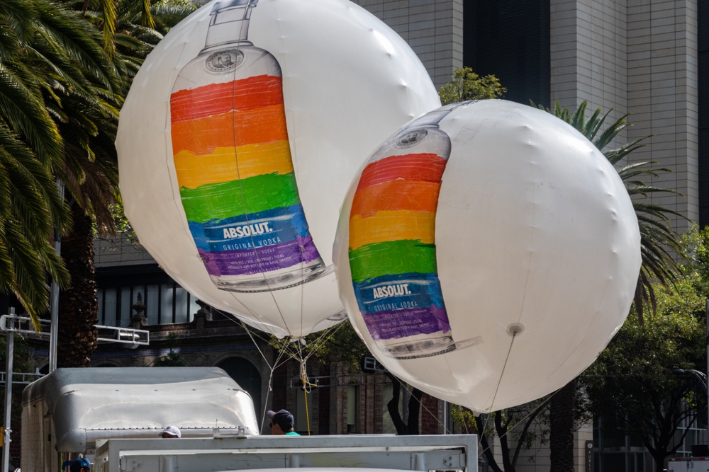
Absolut partnered with LGBTQ organizations to create a firestorm of an ad. It features two homosexual couples kissing with the bottle in the middle.
Also, notice the colors around the bottle – those that represent gay pride. That’s one way to get your message across, and it’s bound to get attention. Mission accomplished.

- Flame Grilled Since 1954
How many of you love Burger King? I certainly do, especially their flame-grilled burgers.
Well, even though we suspected all along that they cooked their burgers in a special way, BKs latest ad campaign brilliantly confirms this fact.
BK has famously had many restaurants burn down thanks to their flame used in cooking their burgers.
You know what they say, never let a good tragedy go to waste… As you can see here.
- FCK
For a time in the UK, this was put on their chicken buckets. No, we’re not trolling.
This was due to KFC running out of chicken thanks to a disagreement they had with a distributor.
KFC handled it like a champ though and wrote a decent apology on the ad.
- Just Because
The brand Chambord, which likes to encourage women to do as they please without feeling pressured by societal norms, added a random cabbage in their ad. Just because. And that’s it. A lesson that even the most seemingly random ad can create massive success.

Conclusion
All these print ads required companies to think outside the box. That’s the key to creating an emotionally compelling print ad in the age of abundant memes and digital media.

Here’s what we saw that worked:
- It’s worthwhile to partner with outside groups and causes to create a print advert that speaks to your target audience.
- There’s also a lesson in seizing on past failures to create future successes.
- Creatively using colors also helps get the messaging across.
- Using print ads in public apologies works wonders.
- Popular culture can be used in print ads.
- Meme-ifying your ads works too.
- Disgust works surprisingly well in many kinds of ads
What are your takeaways from this list?
How do you think you should start using print media to advertise your business?
We’d love to hear your thoughts in the comments!
