
10 Helpful Design Tips to Help You Design Your Ad
With the trend in digital going big nowadays, local business advertising has shifted from print marketing to digital advertising. However, this does not mean that print marketing is not effective anymore.
In fact, research showed that more than 80% of consumers have acted on the call to action of magazine ads. This is better than the 45% who have responded to online advertisements, primarily because of the saturated market in digital.
So, if you’re still maximizing the powers of print advertising, here are some tips on how you can influence your consumers’ buying decisions.
1.) Maximize The Right Hand Side
Psychologically, readers prefer reading the right-hand side of the magazine more than the left one. Most individuals skip the content on the left. Therefore, it is a great strategy to place the majority of your call to action on the more effective side of the magazine.
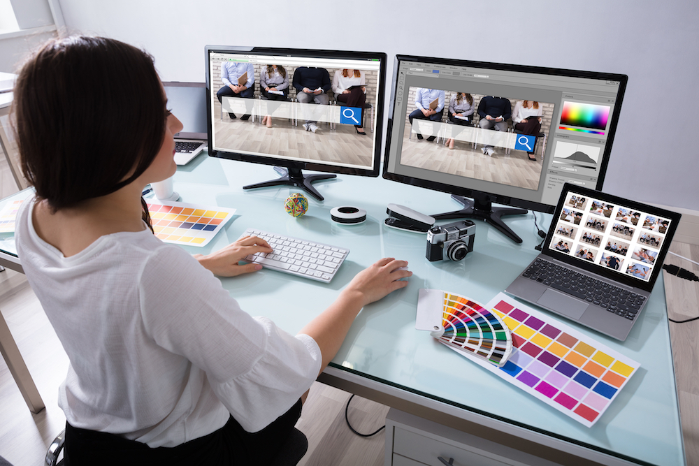
2.) Use the Correct Color Combinations
Mixing the correct colors is one of the best techniques to captivate your readers. You just have to know which ones provide the best contrasts. When looking at the color wheel, look for those that are found opposite each other since these are the ones that complement each other.
Remember that using too many bright, bold, or loud colors on your print ad is a no-no. This is because your readers might miss the primary messages of your ad. These bold colors have a huge tendency to overpower some areas of your messaging. So, ensure that color accents are used wisely.
3.) Apply the ‘ABC Rule’ With Your Cover Designs
The first touchpoint of your magazine ads is the cover. There’s no point perfecting the inside content of your magazine if your customers don’t pick it up and read it. The more eye-catching your cover is, the higher the possibility of capturing your audience’s attention and making them delve deeper into the stories inside.
To help you make your cover stand out, make sure to apply the ABC rule. This is a strategy used by expert designers when making the covers of the biggest magazines in the world.
So, what is the ABC rule?
First, stick to one A-heading, which is also known as the magazine title. This should be the main focus of the passers-by. Although some local business advertising titles might not be familiar to people, it’s a great start to introduce the branding to their target market.
Second, there should be a (B) subheading (which will be the primary call to action) coupled with smaller (C) sub-headings that will support your main claim. The ABC rule is proven to promote layout balance, and almost every big magazine brand applies this.
4.) Apply the Right Font
Use a maximum of three fonts in your content. Connecting to the ABC rule, each part should have its assigned font wherein the title has the biggest and boldest one to make it stand out.
Once you have decided which font to utilize, make sure to use it consistently. Do not have another set of fonts for your inside content. This will only ruin your branding, and the tone will be inconsistent.
As a starter, you may use sans serif fonts for your primary headings. The body of the text, on the other hand, may use serif fonts. This contrast will have a unique distinction between your heading and paragraph, avoiding audience confusion when reading the content.
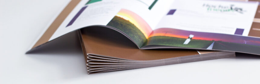
5.) Print With High Resolution
Print ads are usually printed on high-quality paper. This means that photos should also have high resolutions to make them look good. To achieve that crystal clear image, the image should at least have 300 dots per inch.
6.) Improve the Digital Look With Infographics
It’s a known fact that people have a short attention span when reading. They don’t like blocks of text, so it is vital to keep them engaged with different content techniques. One thing that you can utilize in your digital look is infographics.
Experimenting with infographics is a great way to immerse your readers in your message. Although text is involved, the different arrows, dividers, and shapes delve away from the boring look of text-heavy articles. This strategy works for commentary, finance, and sports magazines.
You may also incorporate a couple of pie charts to demonstrate data, statistics, and even maps if geography is part of the content.
7.) Understand Proper Logo Placement
Yes, it is a given that your logo will be included in the mix of your content. However, avoid making the mistake of shaping it as the most important element on the page. This will only deter your audience from seeing your call to action.
8.) Ensure Proper Spacing
Even if you have a large space for your cover, you don’t have to use every corner of it. Balancing the available space is a critical move if you want your audience to fully understand what you are trying to convey.
For simple adverts, you may maximize the use of basic elements to separate the leftover space from the pictures, colors, and lettering. It could also mean applying scenery and imagery to fill up the remaining spaces.
9.) Stick to a Single Theme
Consistency is key if you aim to retain the attention of your readers. Your theme should be included from cover to cover since this will be your hook and hallmark for your overall content.
The best way to go about this is to introduce various key elements on the cover, which will then be carried over to the other pages of the magazine.
10.) Highlight the Call to Action
One vital technique in designing an ad is to make your audience understand what you are trying to make them do. For example, are you selling a particular product or service, or do you just want them to be part of a local community? Whatever it is, do this by highlighting the call to action.
Although digital has taken over the world of advertising, print will never go out of style. Apply these ten designing tips, and you’ll come up with the best ones in the market.